Negative layouts to avoid can make the difference between landing an interview and getting overlooked. Your resume is often the first impression you make on a potential employer, and the way it is structured can directly impact whether a recruiter spends more than six seconds reading it. While content is important, poor design choices can bury your achievements under a confusing or unattractive format.

In this guide, we’ll look at four negative layouts to avoid so you can make sure your resume stands out for the right reasons.
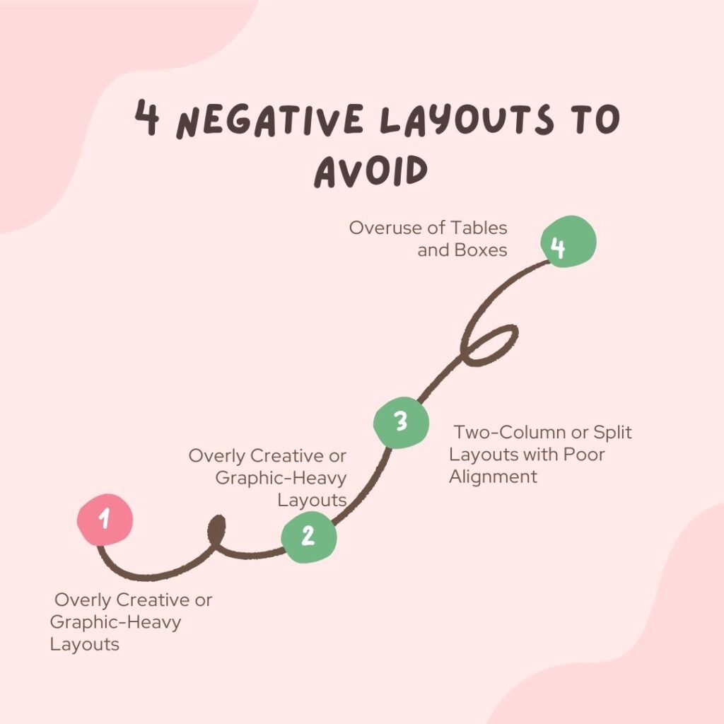
1. Overly Creative or Graphic-Heavy Layouts
One of the most common negative layouts to avoid is going overboard with creativity. While it’s tempting to add bright colors, multiple fonts, and graphics to “make your resume pop,” these choices often do the opposite. Applicant Tracking Systems (ATS), which most companies use, struggle to read resumes with complex layouts, images, or unusual formatting.

Why it’s a problem:
- ATS may fail to parse your information, meaning your application never reaches a recruiter.
- Too many design elements can distract from your actual qualifications.
- Non-standard fonts may not display properly on all devices.
Better approach:
Stick to a clean, professional template with consistent headings, legible fonts, and a clear hierarchy of information. Use bold or italic text sparingly to highlight key achievements rather than relying on heavy graphics.
2. Dense, Wall-of-Text Formats
Another negative layout to avoid is the wall-of-text resume. Even if your experience is impressive, cramming it into large, unbroken paragraphs makes it hard for recruiters to skim quickly. Remember, hiring managers often scan resumes in seconds before deciding whether to read more in-depth.

Why it’s a problem:
- Makes it difficult to pick out key skills and achievements quickly.
- Reduces visual appeal and readability.
- Can overwhelm the reader before they even start reading.
Better approach:
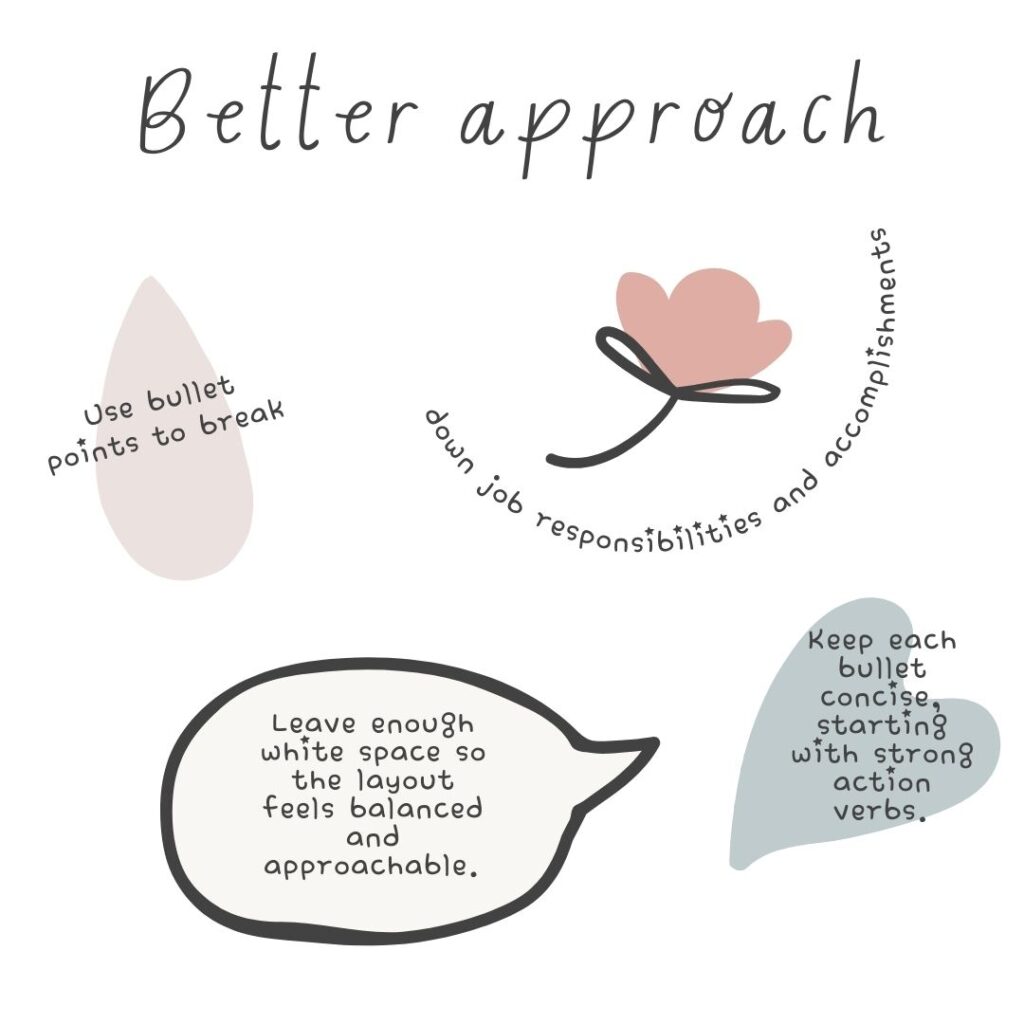
Use bullet points to break down job responsibilities and accomplishments. Keep each bullet concise, starting with strong action verbs. Leave enough white space so the layout feels balanced and approachable.
3. Two-Column or Split Layouts with Poor Alignment
While two-column layouts are sometimes effective, poorly executed versions are a major negative layout to avoid. Misaligned text, inconsistent spacing, or squeezing too much into a narrow column can make your resume appear disorganized.

Why it’s a problem:
- Causes readability issues on smaller screens.
- Creates visual imbalance if sections are uneven in length.
- Confuses ATS software if the reading order isn’t clear.
Better approach:
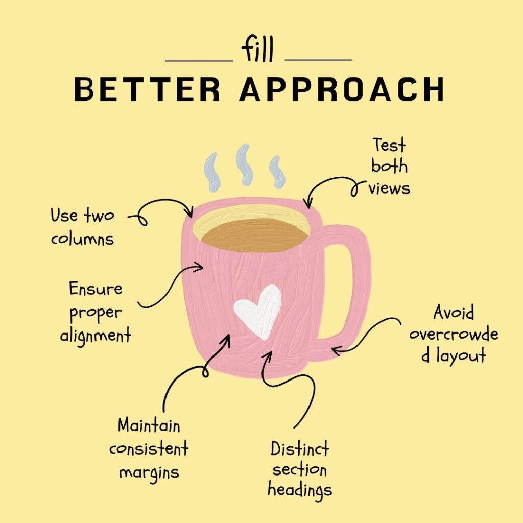
If you use two columns, ensure both are properly aligned and maintain consistent margins. Keep section headings distinct and avoid crowding too much information into one side. Test how the resume appears on both desktop and mobile views.
4. Overuse of Tables and Boxes
Tables and text boxes might seem like an easy way to organize information, but they’re another negative layout to avoid. While they may look neat in Word or PDF format, they often break when converted for ATS parsing or uploaded to job portals.

Why it’s a problem:
- ATS systems may skip information contained in tables or boxes.
- Overuse of rigid layouts can make the resume look dated.
- Complex formatting can become distorted when opened on different software.
Better approach:
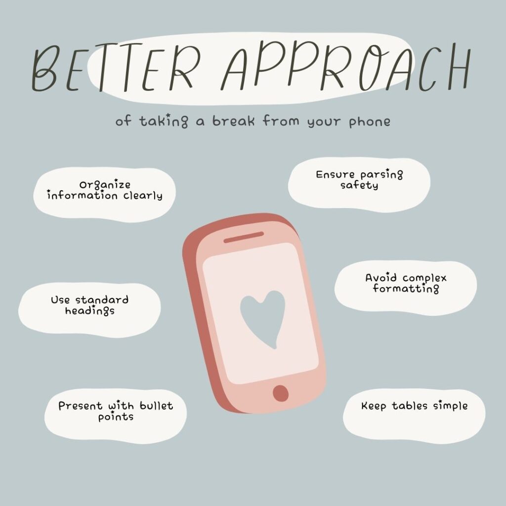
Organize your information using standard headings and bullet points. If you must use a table, keep it simple and avoid embedding critical information that you can’t afford to lose in parsing.
Pro Tips to Improve Your Resume Layout
Beyond avoiding these negative layouts to avoid, here are extra tips for creating a polished, recruiter-friendly resume:
- Keep margins between 0.5–1 inch for a clean look.
- Use 10–12 point font size for body text and slightly larger for headings.
- Ensure your file is saved in both Word and PDF formats for flexibility.
- Always test your resume in a plain text format to see how it reads without formatting.
Read more : For What Not to Put on a Resume:
Final Thoughts
Avoiding these negative layouts to avoid can instantly improve your resume’s readability and ATS compatibility. Remember, a great layout doesn’t just look good—it strategically highlights your skills and achievements to make the best impression possible.
When your layout is clean, consistent, and professional, you help recruiters focus on what matters most: your qualifications.
Want a professional resume that gets results?
Let us help you create a layout that’s visually appealing, ATS-friendly, and tailored to your industry. Contact us today for a free resume review and expert layout advice!
Email: info@unlockdiscounts.com
Call: +91 94819 60948
website : www.unlockdigiservices.com
FAQs – Negative Layouts to Avoid
Q1: Why should I avoid overly creative resume layouts?
They may look appealing to humans but confuse ATS software, preventing your resume from being read.
Q2: Are two-column resumes bad?
Not always—only poorly aligned or overcrowded two-column layouts are considered negative layouts to avoid.
Q3: How do I know if my resume layout is ATS-friendly?
Run it through an ATS simulation tool or paste the text into a plain document to check for missing content.
Q4: Can using tables hurt my resume?
Yes, especially if critical information is inside the table—ATS may not read it correctly.
Q5: What’s the safest resume layout?
A clean, single-column format with clear headings, bullet points, and consistent spacing is universally ATS-friendly and recruiter-approved.


One Response