Website Development Wins: 4 Positive Layouts That Convert
When it comes to building a website, design isn’t just about aesthetics—it’s about results. At Unlock Digi Services, we know that website development wins are achieved by creating layouts that not only look great but also convert visitors into customers.
In today’s digital-first world, your website is often the first interaction a potential customer has with your brand. A poor layout means lost opportunities. On the other hand, the right layout can increase trust, engagement, and conversions dramatically.
In this article, we’ll break down 4 positive website layouts that convert, explore why they work, and show you how you can use them to drive measurable business success – website development wins
Why Layout Matters in Website Development
A website layout is the foundation of user experience (UX). Think of it like a store layout in the physical world—if everything is cluttered, confusing, or hard to find, customers walk away.
A winning layout:
Guides users toward their goals effortlessly
Highlights key information in a clear hierarchy
Encourages clicks, sign-ups, or purchases
Reinforces your brand’s credibility
According to HubSpot38% of users will stop engaging with a website if the layout is unattractive.
The 4 Positive Website Layouts That Convert
1. The Hero-Centric Layout (First Impressions That Sell)
The hero section is the first thing visitors see. This layout maximizes impact by using:
A bold headline that communicates your value instantly
A subheadline that clarifies your offer
A strong CTA (call-to-action) above the fold
Eye-catching visuals (images, video, or animation)
Why It Wins:
This layout works because it captures attention immediately. It reduces bounce rates by answering “What’s in it for me?” in the first 5 seconds.
Example Applications:
SaaS product websites with a free trial CTA
Service businesses showcasing expertise
Ecommerce highlighting bestsellers or seasonal offers
Best Practice Tip:
Keep your CTA button color contrasting and use action words like Get Started, Book Now, Try Free – website development wins.
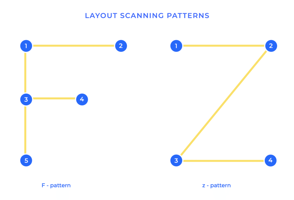
2. The Z-Pattern Layout (User-Friendly Flow)
Users naturally scan screens in a Z-shaped pattern: left to right at the top, diagonally down, then left to right at the bottom.
Why It Wins:
This layout follows human eye movement, making content easy to absorb. It places critical elements—logo, navigation, value proposition, CTA—right where users expect them.
Example Applications:
Portfolio websites showcasing creativity
Corporate websites with simple messaging
Landing pages for lead generation
Best Practice Tip:
Use the top-left space for your logo (brand recognition) and the bottom-right space for your strongest CTA – website development wins.
3. The F-Pattern Layout (Content-Heavy Success)
The F-pattern layout is perfect for content-driven websites like blogs, news sites, or e-learning platforms. Users read in an F-shape: across the top, down the left, then scanning horizontally.
Why It Wins:
This layout is optimized for scanning, making it easy to deliver large amounts of text, images, or data without overwhelming readers.
Example Applications:
Blogs and knowledge bases
News/media websites
Corporate resources or whitepaper pages
Best Practice Tip:
Use headings, bullet points, and visuals to break text into digestible chunks. Place important CTAs in the left column or within content blocks – website development wins.
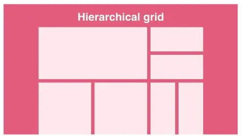
4. The Grid Layout (Order and Balance)
The grid layout uses a clean, structured design with evenly spaced elements. It’s perfect for sites showcasing multiple products, services, or portfolios.
Why It Wins:
It creates visual balance, reducing cognitive load and improving navigation. Grid layouts are also highly responsive, ensuring they adapt seamlessly across devices.
Example Applications:
Ecommerce stores
Photography or design portfolios
Business service directories
Best Practice Tip:
Keep grid cells uniform in size. Highlight premium or featured items with larger grid spaces to attract attention – website development wins.
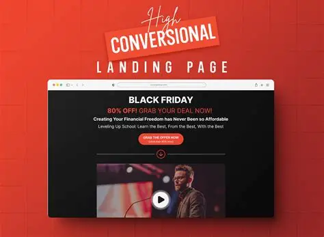
Bonus Layout: The Conversion-Focused Landing Page
While not one of the “core four,” a dedicated landing page deserves a mention. Built around a single goal, it eliminates distractions and maximizes conversions.
According to Unbounce landing pages with clear, singular CTAs can improve conversion rates by up to 80%.
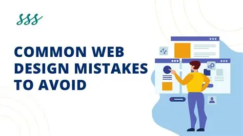
Common Website Development Mistakes to Avoid
Even the best layouts fail if combined with poor development practices. Avoid these pitfalls:
Slow load times (users abandon after 3 seconds)
Non-mobile-friendly design (over 60% of traffic is mobile)
Weak CTAs (generic “Click Here” instead of action-oriented)
Too much clutter (too many options confuse users)
How Website Development Wins Drive Business Growth
Choosing the right layout impacts:
Engagement: Visitors stay longer and explore more.
Conversions: Clear CTAs boost sign-ups, purchases, or inquiries.
Trust: A clean, professional design builds credibility.
At Unlock Digi Services, we combine design psychology, SEO, and conversion optimization to create websites that don’t just look great—they perform – website development wins.
Final Thoughts
The secret to website development wins lies in choosing layouts that guide users naturally, highlight your value, and inspire action. Whether it’s the hero-centric layout, the Z-pattern, the F-pattern, or the grid, each plays a vital role in delivering results – website development wins.
Your website should never just be a digital brochure—it should be your hardest-working salesperson.
Ready to Unlock Website Development Wins?
Don’t let outdated layouts cost you conversions. At UnlockDigiServices, we specialize in creating websites that are visually engaging, user-friendly, and built to convert visitors into paying customers. Whether you’re a startup, small business, or enterprise, our expert team ensures your digital presence drives measurable growth.